Color Inspiration
Learn how to choose colors for your home that you’ll love for years.
Try this experiment: take a favorite seat in your living room, one where you see most of your furniture. Relax. Take a few breaths. Look around.
How does it feel? Relaxed and peaceful? Stimulating and energizing? Exciting? Are things harmonious, or is something off-kilter?
Your feelings might be the result of your last meal, a recent conversation or just how good you feel today. Often, however, these emotions reflect your home interior color schemes! The colors that surround us frequently make us happy, romantic, creative or vibrant. If you’re ready for new furniture, new paint or different decor, this could be the right moment to step back and decide how you really want your home’s colors to look.
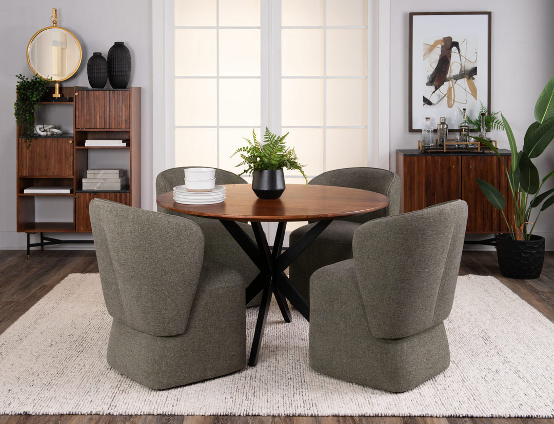
Choose a color scheme for your home
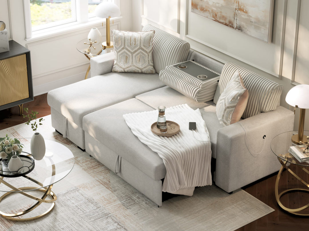
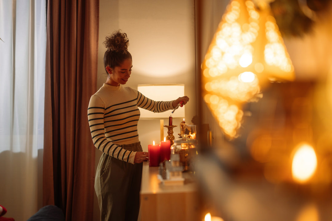
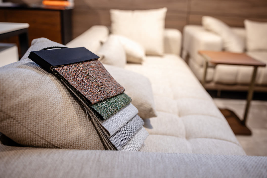
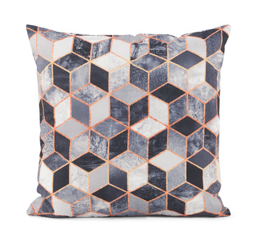
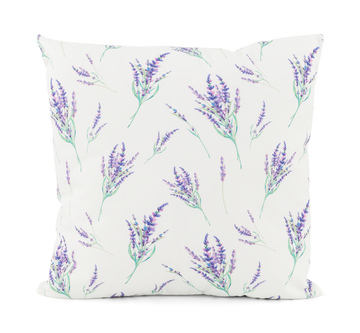
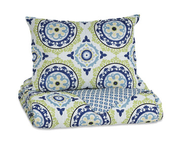
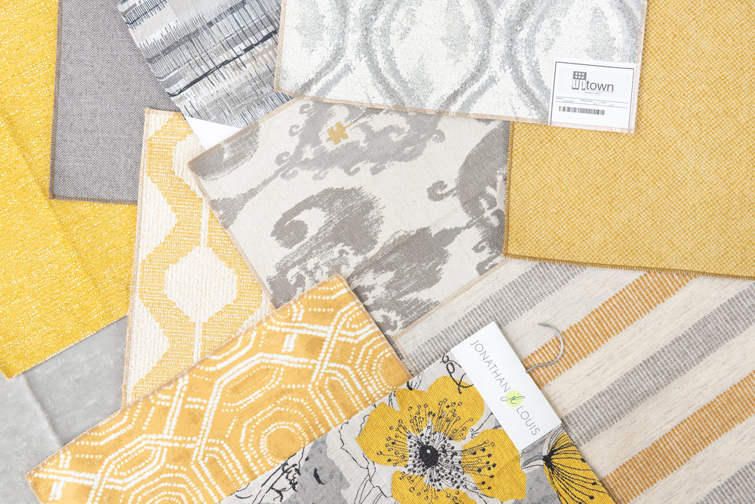
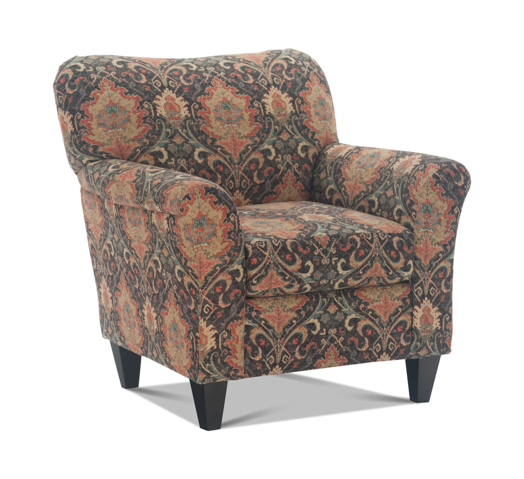
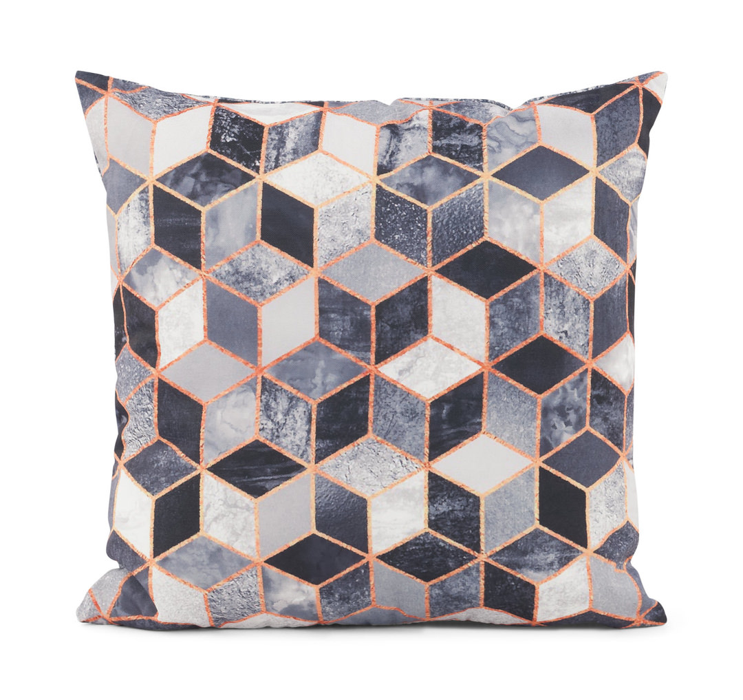
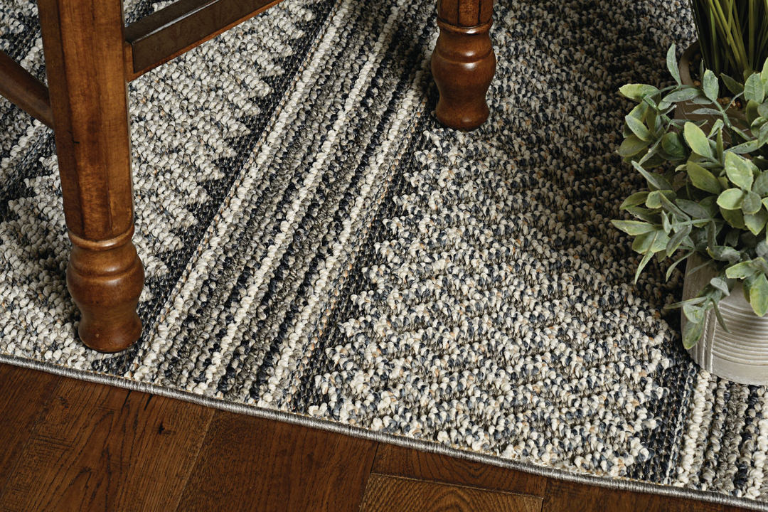
If you’ve never before created a color scheme, a good way to start is by picking a main color. Choose one you love. One idea is to use a color from something patterned in the room such as an upholstered or leather sofa or other upholstered furniture, an area rug, curtains or an accent pillow or throw blanket. Alternatively, select a tone from your favorite piece of wall art. Or take a color from a pattern you don’t own but would like to.
Some other suggestions: if there are large windows, choose the shade in nature that brings you joy when you look out the window. Also, consider your clothes. If you don’t choose to wear green, for example, you probably won’t like green in your house. Embrace the hues you surround yourself with every day.
Next, think about a secondary color. It might be closely related to the first one you chose. Or, if your first color is a bold one, your second can be a neutral such as beige, gray or off-white. Another thought: if you picked color number one from a pattern, choose number two from something else in that same pattern.
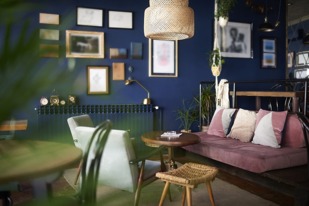
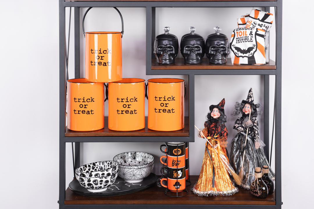
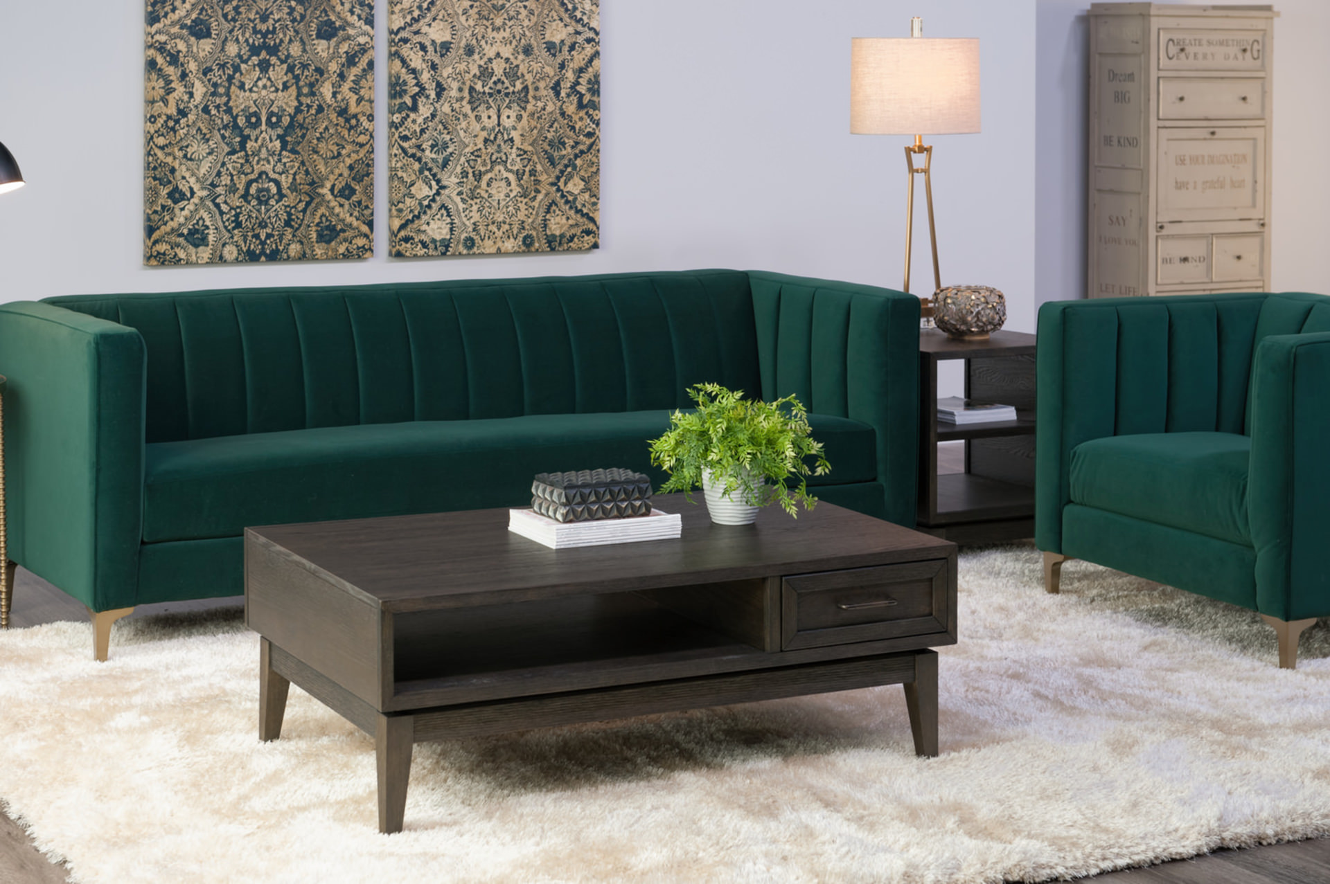
The third color should be a contrasting or accent color. Consider the 60-30-10 rule, where your main color gets about 60 percent of the show. This can translate to number one on the walls, number two on the upholstery, and number three for accents and decor. In your 60 and 30 colors, it’s okay to use different shades from the same family, but accent or “pop” colors need to match closely.
Finally, don’t be afraid to take your chosen pattern or artwork to the furniture and paint store when you’re making selections.

How to choose paint colors for your home interior
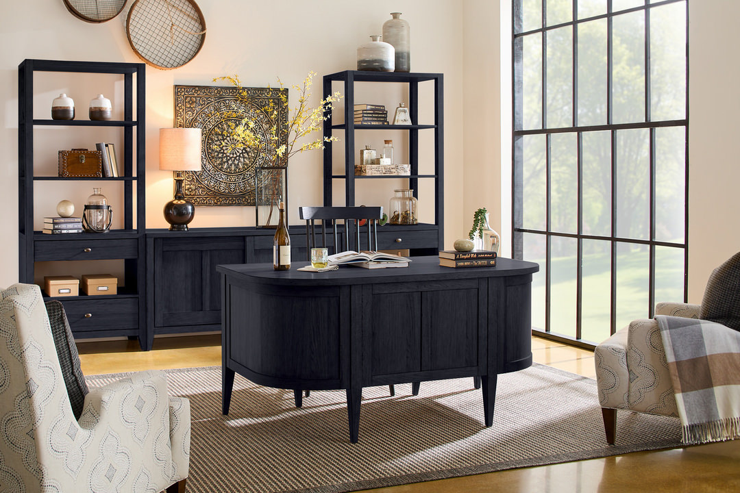
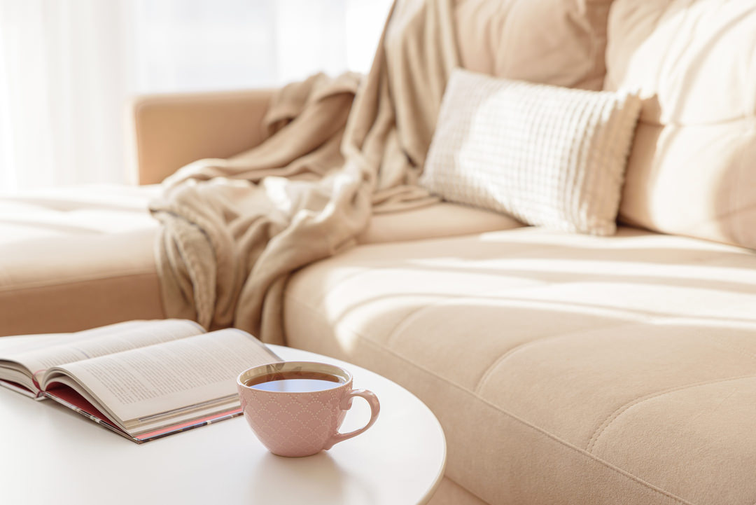
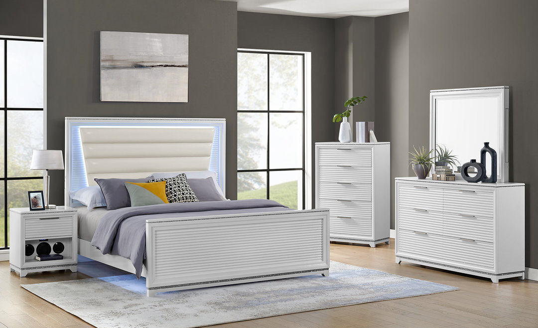
It’s best to have your overall color plan in mind before you buy your first gallon. When choosing your paint color scheme, consider the different personalities colors have. Similar shades (e.g., various tones of blue) bring a monochrome effect and a soothing feeling. Light and soft colors—lavenders, blues and pale yellows—tend toward a tranquil and romantic feel. Assertive colors such red, orange and gold speak of vibrancy. Neutrals are classic and flexible; you can change the room without repainting the walls. Grays make a room feel bigger. Green is associated with harmony. It’s hard to go wrong with beiges.
Think about these tips:
- Vary texture, from glossy to flat, as well as varying colors.
- Painting the ceiling darker than the walls makes the ceiling look lower.
- Matching molding and door trim make for a pleasing effect.
- Accent colors draw the eye.
- Darker walls and lighter trim from the same family can “expand” the room and make it pop.
- White sometimes takes on its neighboring colors so convincingly that visitors won’t believe it’s really white.
- Use paint swatches not only for the paint color but also bring home some that match the upholstery you plan to add.
How to pick colors for a room
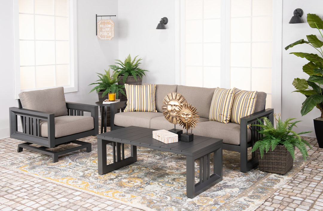
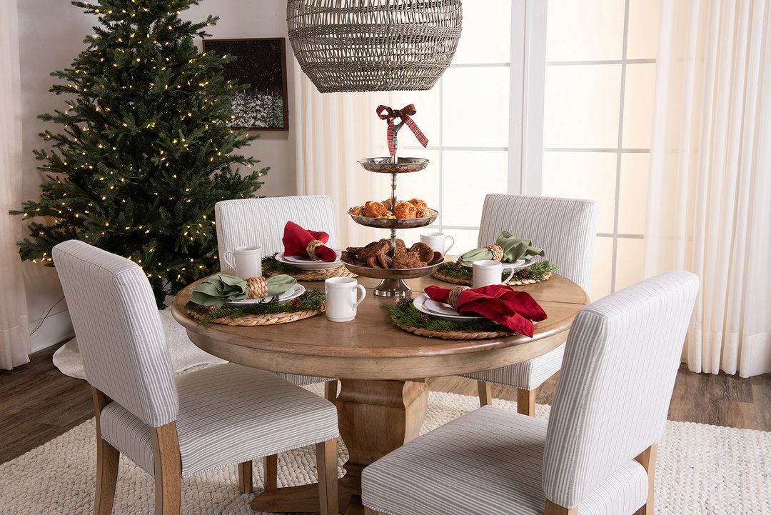
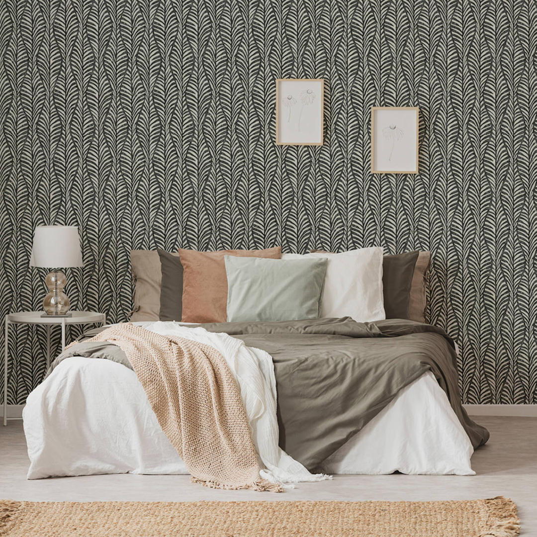
Start with the biggest rooms, usually the living and dining rooms. This is where outside-the-window colors might be put to great use. One possibility for your room color palette: use the darkest colors on the floor, mediums on the walls, and light colors on the ceiling. This echoes the natural world and lifts the eyes and spirits
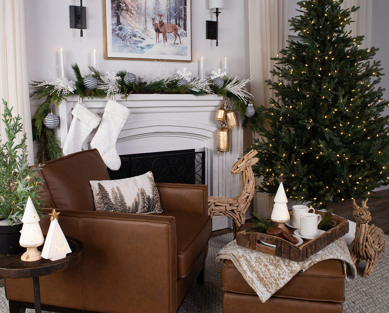
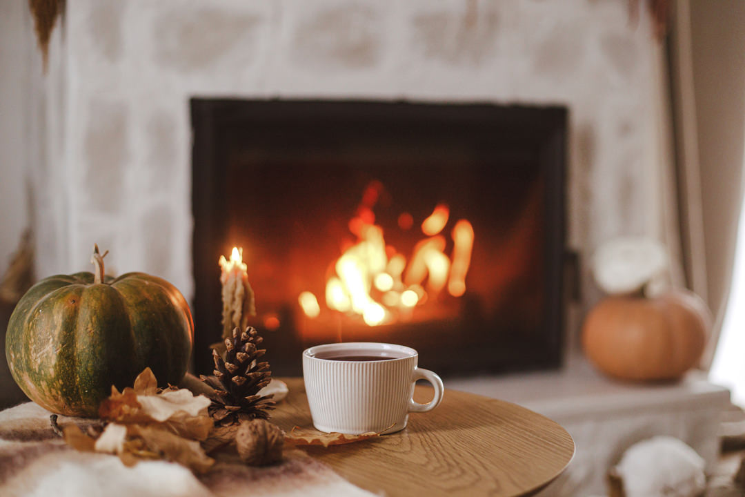
Is this room going to be used mostly in the daytime or after dark? Is there plenty of natural light? Bright tones such as emphatic greens and blues look best in the sun. Dark earth tones need natural light to avoid being too dim. To brighten a low-light room, try ivory and yellow or lighter shades of green and blue. Golds, browns, reds and oranges lend coziness and comfort. Cool colors such as violets, grays and blues tend to be calming, especially in a room used mostly in the evening.
Some suggestions for the other rooms:
- Once you’ve designed your living room, take its accent color and use it prominently elsewhere.
- A big room can handle more colors than a small one.
- Think about including a touch of black—for example, a lampshade or picture frame—in each room.
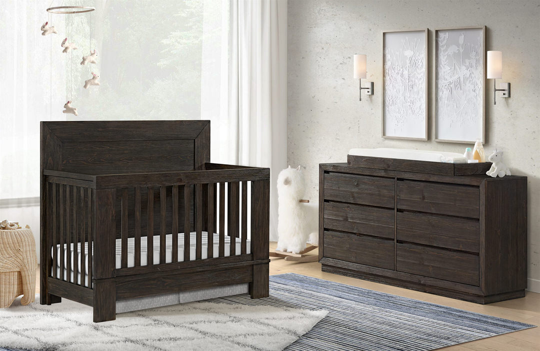
- For private spaces such as bedrooms and bathrooms, use overlapping shades of a favorite color for a relaxing feel. Don’t forget the impact of bath towels and bed covers.
What’s right for you?
A lot to think about, isn’t it? These are just suggestions, and you can’t follow them all. Pick the ones that feel right for you. If your home interior color schemes reflect your taste and your personality, it will look natural. Your friends will see you in it and like it.


2026
July