Pretty in Pastels
How to decorate with pastel colors in sophisticated spaces.
Pastels are frequently relegated to the nurseries in home design, and are tied to more juvenile spaces. Despite the recent love of pastel colors in modern design, like millennial pink, many don’t think of those shades when creating their home design. But pastels are such an underused palette of the rainbow, and can make any room feel soft, fresh and calming. The dusty hues of pastel home decor can be added to so many spaces to lighten up the mood, add interesting visual color and give a comfortable vibe to a space that needs it, all without feeling childlike. Here are some of our favorite ways to incorporate these soft shades into your home in a way that feels fresh and new.
Soft Palettes for Soft Pieces
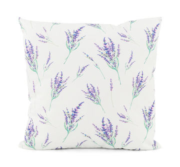
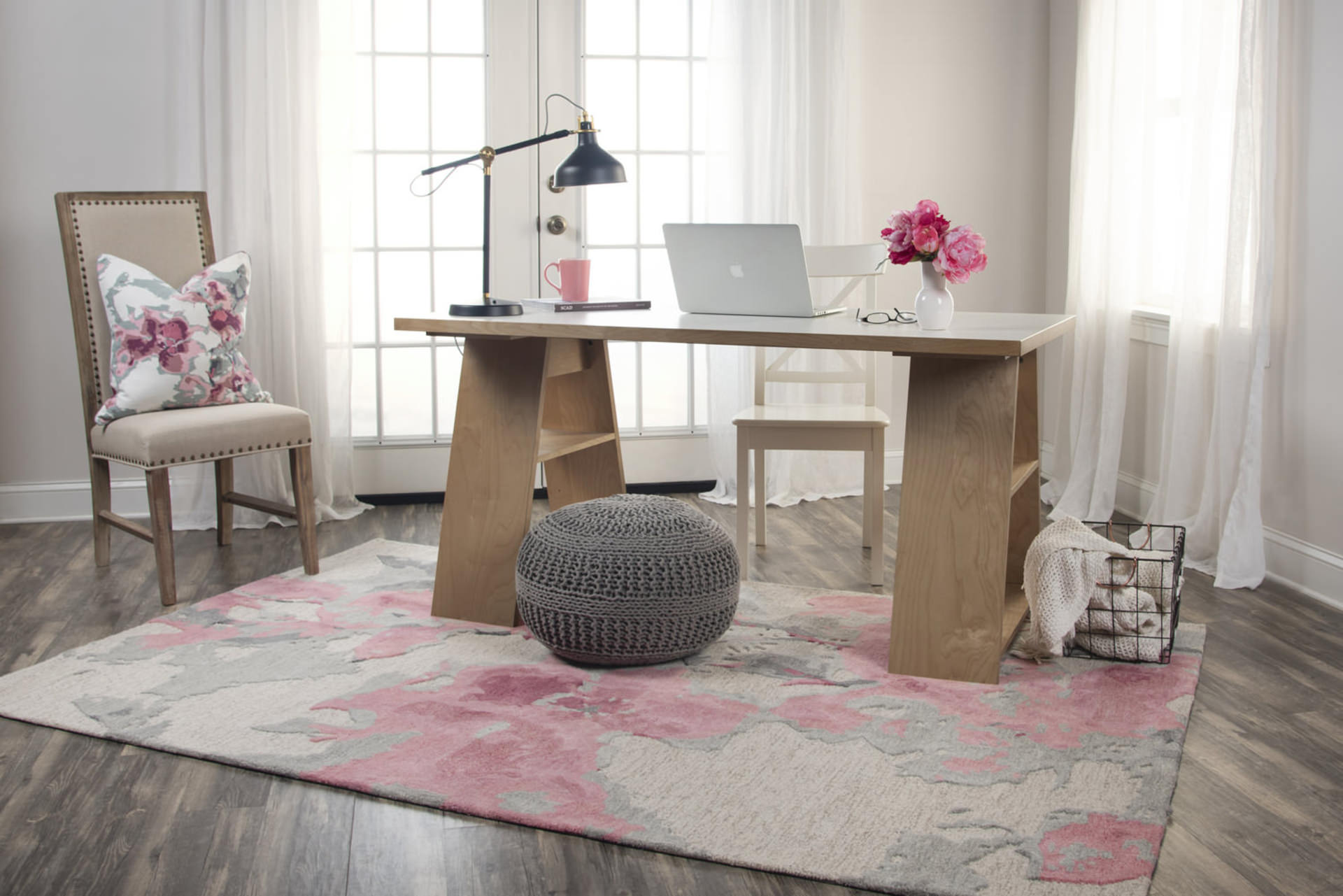
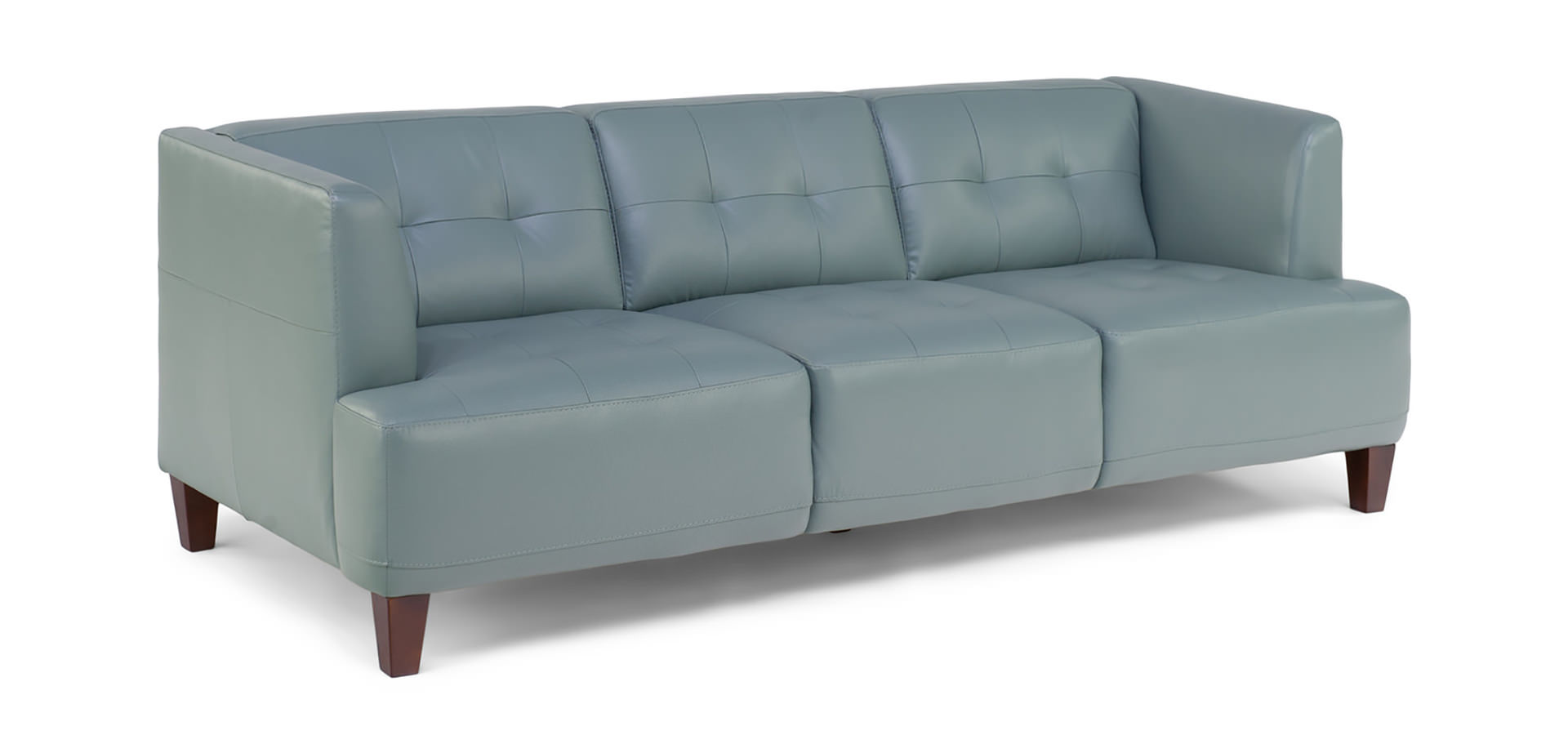
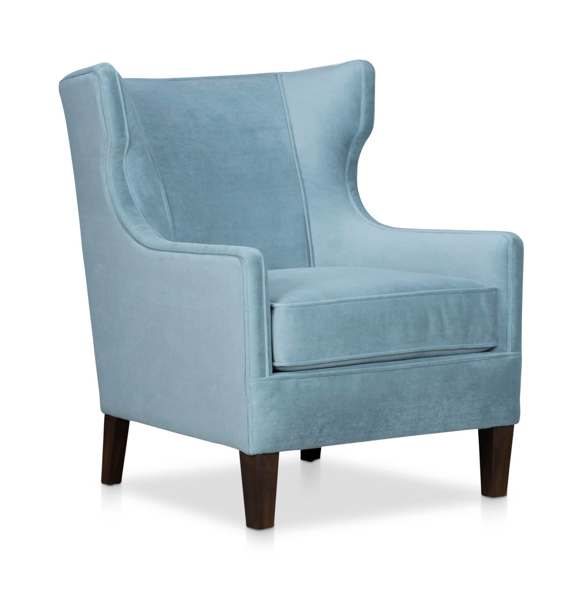
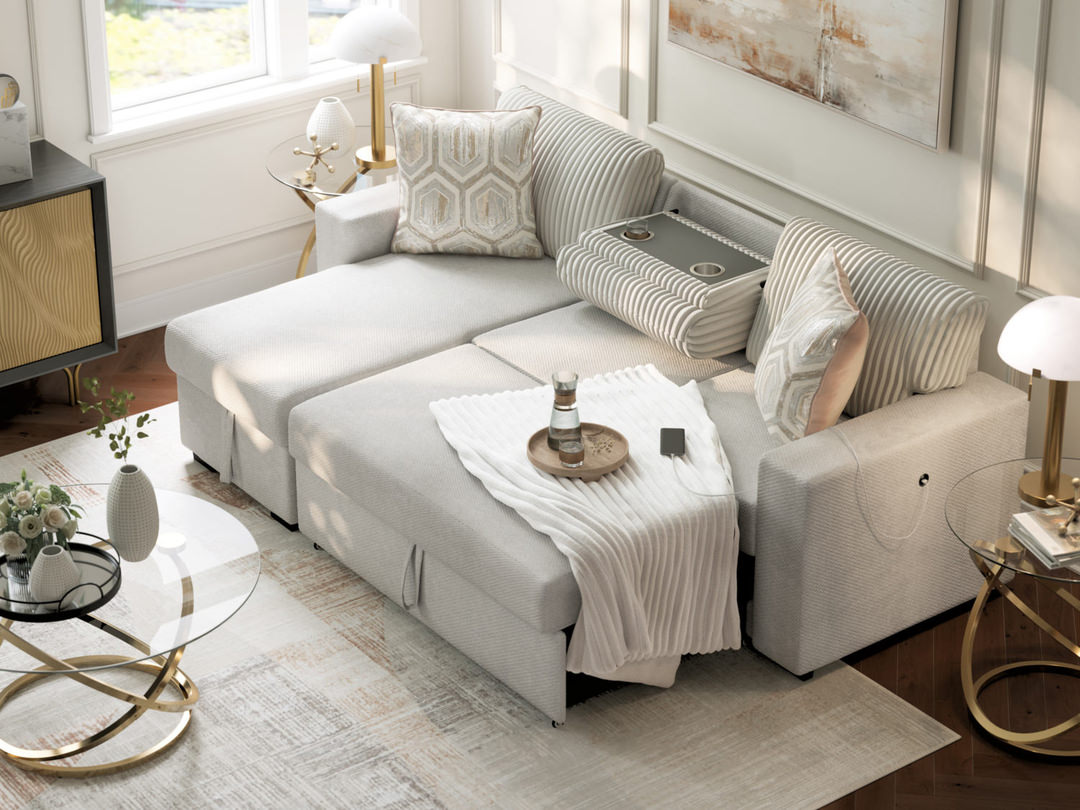
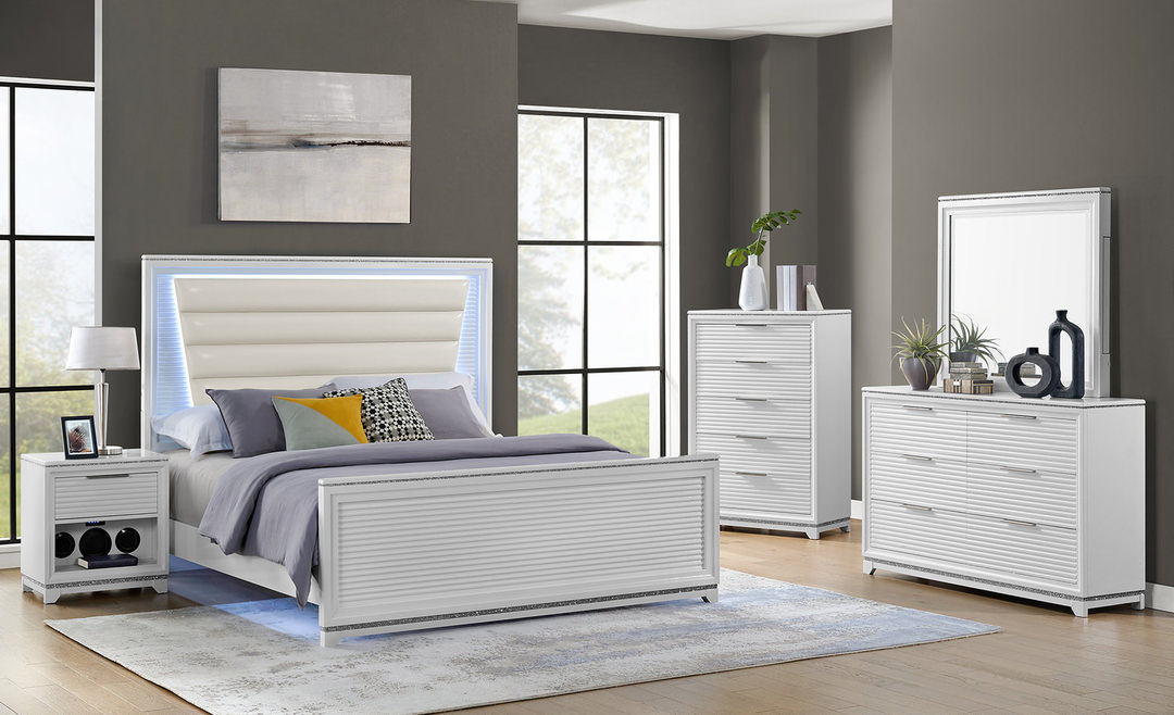
Since pastels are great for creating an airy and soft feel, they lend themselves naturally to softer furnishing like couches, pillows and blankets. Pink sofas got their trendy moment recently, with many people choosing to bring in pastel interior design with one big piece, otherwise referred to as a “hero piece.” If you’re not ready to switch up your couch, however, smaller pieces that pop will do the trick here as well. A delicately colored accent chair in a gentle pastel hue may just be the addition your living space needs to lighten it up.
Pigments that Pop
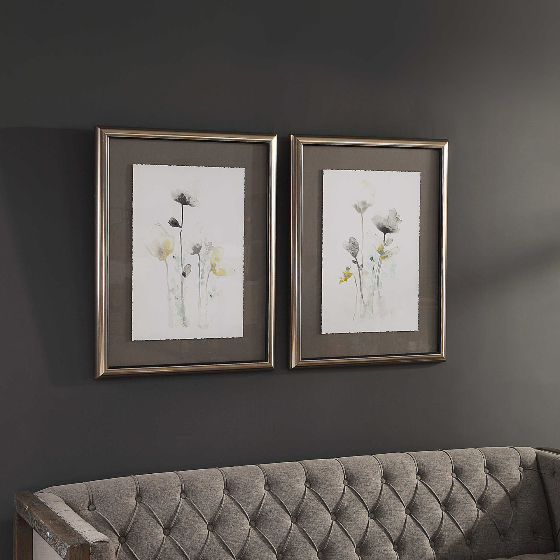
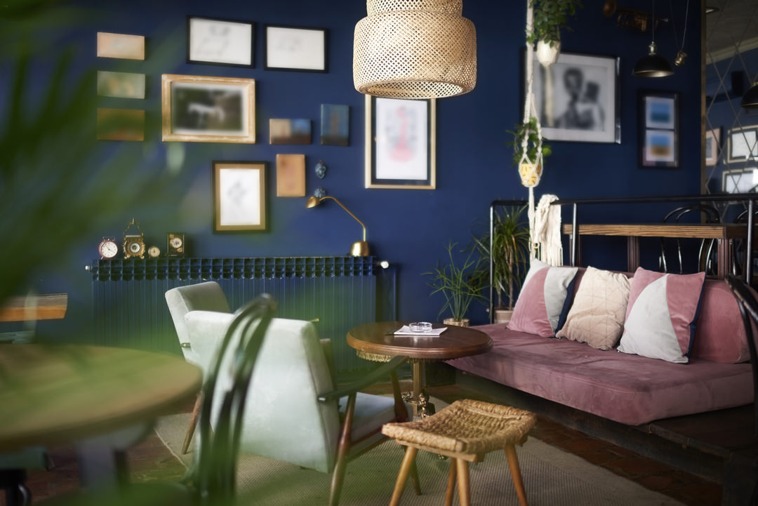
If you’re a fan of the all-white room design, a pop of pastel could be your newest inspiration. Pairing a light pastel in an all-white room can create a wonderful and interesting addition to your room’s color story without overwhelming it or adding in too much color. On the opposite end, for those who lean towards the big, bright and bold, adding pastel into your interior design is a great way to create visual balance. Paired next to more intense hues, pastel designs can catch the eye in a harmonious way.
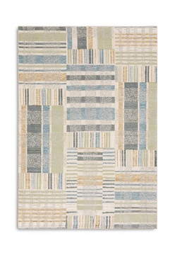
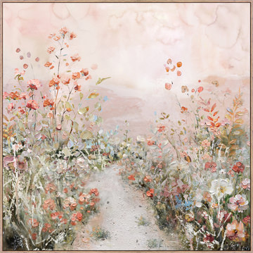
Popular Pastels
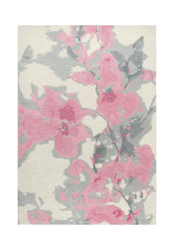
Popular pastel colors as of late include robin’s egg blues, sage or mint greens, soft purples, and of course, dusty pinks and roses. If you’re feeling extra adventurous or inspired by pastel home design, consider working it in with another trendy design style: color blocking monochromatics. Dedicate an entire section of a room (or an entire room!) to one pastel color shade that inspires you for a visually stunning design feature.
A Shade for All Styles
Pastel interior design has strong roots in the cottagecore or vintage styles, if those fit your aesthetic. Using pastel colors in reclaimed or vintage furniture, along with patterns like florals or chintz, creates a strong yet relaxing color story in any cottage inspired room. But for those concerned that pastels may be too feminine, don’t fear the pale hues! Mixing contemporary pieces featuring streamlined looks with your pastels can avoid a more feminine style. Geometric prints work especially well with pastel colors, along with wood tones. They balance out the style and add a more modern and grounded feeling to the room.
Read more about the Cottagecore Design Trend.
Learn about Grandmillennial Style and other Vintage-Inspired Design Trends.
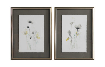
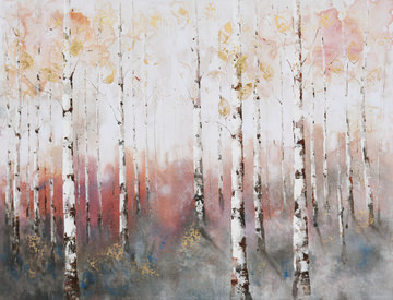
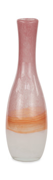
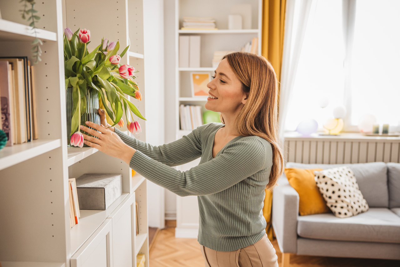
One great way to bring in the pastel inspiration when you’re unsure of where to start is fresh flowers, as well as the vases you place them in! Finding blooms with naturally beautiful pastel shades to add some life and airiness to a room is a simple solution to feeling stagnated in your space. And maybe it will inspire you to “branch” out beyond the buds to incorporate more pastels into your home and space!


2026
July
June
May
April
March
February

January

2025


Related Products